Writing a character… And animating a start menu.

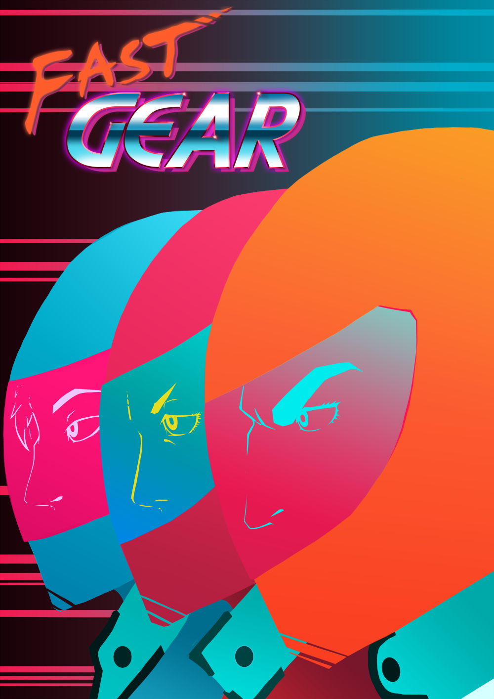
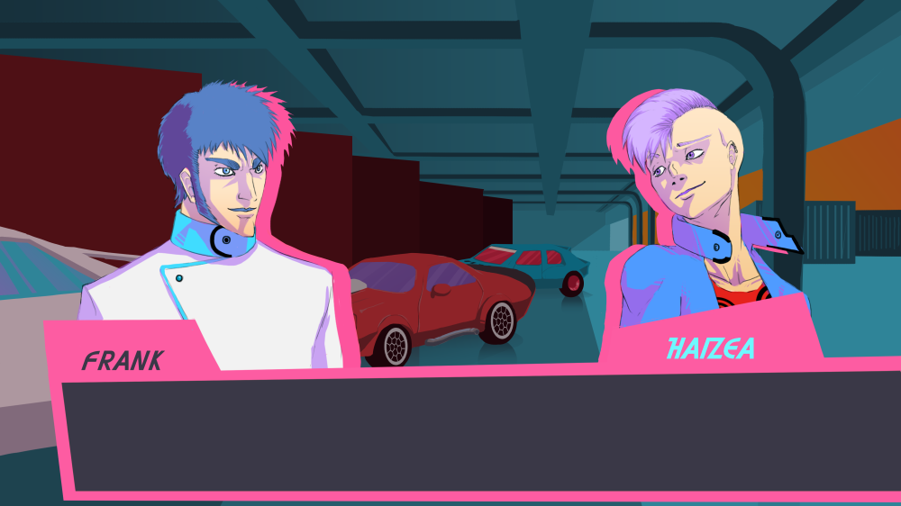
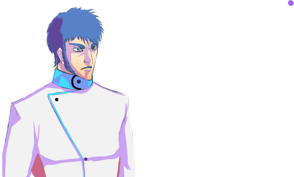
So, since our writer had alot on his plate besides writing for the characters, I took it upon myself to write a bit for one of our driver-characters, Haizea Alonso (see picture below)

Cool portrait

Now, this is more or less a result of a big problem with how we planned our project, that being that for a game which main standout feature is the story between races, we haven’t had a proper script during the whole of the development period. We have ideas for characters, and we got those ideas into character-designs, but it’s only until now, at the end, that we’ve started writing proper dialogue for them. This is ofcourse, a problem and something that we should’ve thought about before.

I suppose a reason for this is that the programmers have been busy with the racing, especially the AI of the competitors, that it took a long time before they properly started working on the dialogue-system, so the script got pushed back with that in terms of priorities as they worked on the racing.

One other problem is also that the difficulties that they experienced when programming our ranking-system for the racing also made it difficult to implement a system that would change the dialogue depending on the outcome of the race, which is also one of the selling points of our game. This meant that the dialogue we wrote had to be vague enough as to be able to work wether you won or lost, and in the end I think that this is the biggest failing of our end-product.

I’m not a writer in the first place, but I tried to capture the spirit of the character in her dialogue, make it feel natural, and also give the player decisions in what to say to gain some varying dialogue from her.

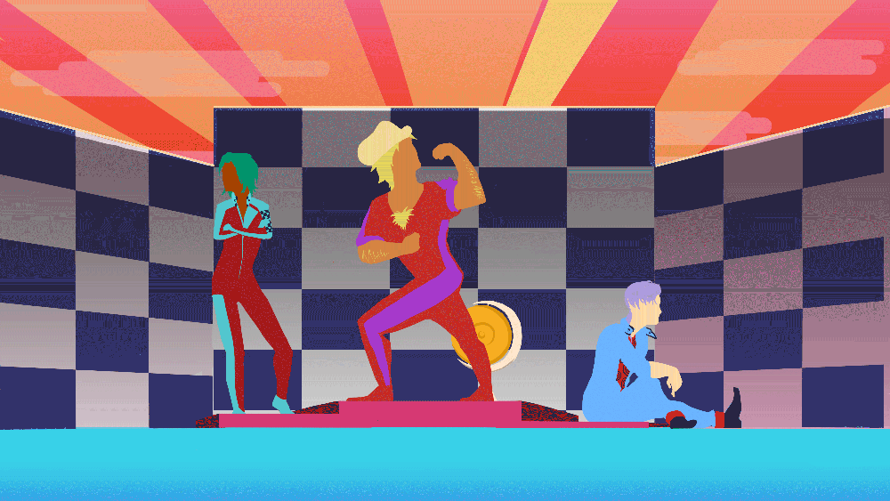
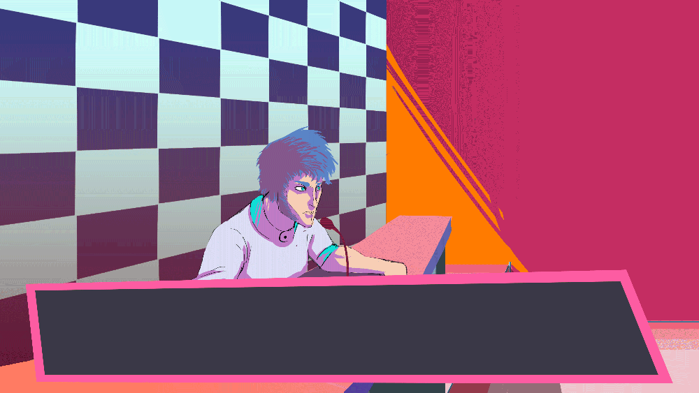
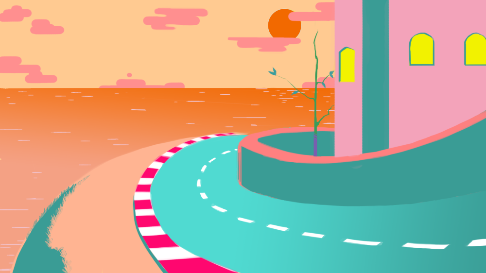
Either way, I’m an artist first, so lets end this post on a high note, with something I’m actually pretty happy with: Our start screen:

Main-menu5

I wanted to capture a high speed energy and capture the style of our game in the same image, and this was the result. When we were first gonna implement it I had read that Unity didn’t accept gif-files, so I thought the best way to implement it into unity was to cut it up into different sprite-sheets, but as the sprites are so big it made it a bit difficult. The best example of this was the head, which I had to split in two, but planned to put it together in unity again. There was alot of weird problems that became apparent when we tried to implement the spritesheets though, like artifacts that weren’t present in the sheets and a very noticeable seam at the middle of the head.

Then I discovered that you can implement mp4-files as moving textures in unity and all was well. Well, except alot of time wasted trying to get this to work.

In the end it worked out though. I guess that’s how you learn alot of things. Through trial and error.


That’s all for this time, Thanks for reading!

The award scene (And a poster)

When the race concludes, we wanted to make a scene where we show the placement of the characters in said race. To do this we’d have to make sprites for each and every combination of results that could be achieved. Since these characters will be set more naturally into the environment than the dialogue-scenes, I thought that they should match the simplicity of the environment. This means that they’re more or less colored silouettes. So to get across the emotions of these characters and their personalities I would have to rely entirely on body-language.

Prize4.png

To be able to put together the scene in unity, I divided the different parts of the scene in different background and foreground-sprites. I also thought that by making the spotligts from behind the set that you could make it look a little more dynamic by making the different pillars of light fade in and out. Something like this:

Prize4

(excuse the crappy image quality)

Now, in the end this didn’t really matter. Since we got behind schedule a bit on the implementation of the awards scene in unity I made each and every possible combination into an animation that we could use as an animated texture in the enginem which would cut down on programming time for our programmers. Hopefully it’ll be implemented before we’re gonna showcase it at the Gotland game conference.

I also made a cover for the SGA document, which you send in to the swedish video game awards to explain your game, it’s concept, mechanics and controls, so that te judges can get into it at once. Since I was a bit hardpressed at time, I didn’t want to go with a risky concept with alot of difficult angles or such, so I thought that it wold be an opportune time to show of the most striking part of our aesthetics instead: our color scheme.

Fast Gear poster

The image is done in a style similar to our start screen. It’s our three main drivers in the game and the color of the helmets represent our main color scheme. The title was made by our car designer and 3D-artist, and is here even more polished to look as 80’s as possible.

We also tried to print out this image to use as a poster for our GGC-booth, so I scaled the picture up to A3-size and cleaned up any blurry outlines that appeared as consequence of the upscaling, but in the end the schools printing-machines didn’t want to work. Why that is we don’t know, but that’s how it is.


And that’s all for now. Have a good day!

Garage background and dialogues.

So aside from our press-conference, we were also gonna have someplace else where the character interacts with the other drivers. As everyone is in their racing-gear it would make sense to set these interactions in the garage before and after the race. For this I looked at some different garages and chose one picture that I built my own upon.nascar

The more difficult thing to decide with this was how stylized I should make it, and what colors I should use. In the end it ended up quite abstract. I did get a comment however on the red walls on the left, that they stood out too much, so in later renditions I made them a bit darker.

Garage true

In the finished version I defined more of the envionment, with shadows and gradients, as to not look as flat. I also added each car that the characters were driving in the race, using our car-designers concepts to do so.

Garage true4

All in all, this is how the dialogue sequences are supposed to look in-game which will hopefully hold true in the final product. By darkening the picture behind them I want to make them pop off the background.

Garage true4d


And really, that’s all I’ve got for this entry.

Have a good day!

Press conference scene.

So, the game will have the character-dialogues to further your relationship with each of the main characters, but there’s another important thing that you do between races: Press-conferences.

Now, this isn’t that different from your interactions with the characters, but in presentation we wanted to make it more distinct, instead of just having a dialogue-box with different portraits above it like all the other times. This would also make it easier to communicate that the player is talking to a mass of people and not just a single person.

At first we thought about just having a static camera in front of the player character and then having people ask questions from off-screen, like in our early concept:

Speed Gear press conference3

This would work for sure, but it also felt like it would get a bit boring pretty fast, so we came up with another structure for the scene.

The image is about 1080x3960p, able to fit two screens horizontally. On one side the character will sit and on the other there are a group of journalists.

Press_Conference


The thought behind the journalist being grey and melding into one another through their black shapes was to give them each less of an identity and more of a collective form, kind of working like a very big character-portrait for the whole group.

To make this transition back and forth between the player and journalists more dynamic we’re gonna implement a camera-sweep from side to side whenever one or the other talks.

A big inspiration for this choice of presentation was the Phoenix Wright-games, which uses this swishing camera-transition alot when going from character to character in the courtroom-cases dialogues. I made a mockup of this in photoshop, though in Unity it’ll be as simple as panning the camera back and forth.

Press-conference-true1

As I felt it would get a bit static and boring as it is right now, I also animated a kind of talking-icon which we’ll be able to use above the crowd to better communicate that they’re talking.


Talking-animation

So that’s it so far concerning our press-conference-scene. The camera-sweep has at this point in time been implemented, and the spritesheet for the talking animation is also ready to bring into the engine. Further polish may occur if we have the time to do so, probably animations for the main character in that case.

That has been it for this time, thank you for reading and have a good day!

Daniel Qvarnemark.

Characters

Our game is described as a story-oriented racing-game. They idea is that the results and events that happen during the races will change how people percieve you.

Ofcourse we have the press conferences, where the player will get to answer questions which will build up expectations on the play player during the race, but we also wanted to have more intimate character-interactions, which are mostly with you fellow drivers.

In the vertical slice of our game that we will show during GGC, we want to have atleast two other drivers driving against you. Since the story is important our designer wrote a general sum-up of each character before we started designing them. What their personalities and such where and how that would dictate their looks and poses.

First we have Angela, the champion of Neo Grand Prix. Her demeanor is very to the point, cold and calculated.

One of the most important parts to get right with her character was her eyes. Getting that worn down, but focused and pierceing look.

Angela

This was the concept I chose, so when making it into a portrait that could be implemented into the games dialogue-system I just cleaned up the rough edges and gave her a closed off, no nonsense-style pose.

Angela


For the second character we wanted someone who’s the exact opposite. A rowdy newbie who’s very skilled, but unkempt.

Cool character

Everything from her stance to her outfit should exude cockiness and a certain roughness. The cool blue contrasts to the bright red, like how her cool exterior can give way to an outburst at a moments notice.

Cool portrait

When converting her design into her portrait I gave her a casual looking over the shoulder-pose.

And last but not least, we got our main character, Frank.

When designing him I especially got Fist of the north star on my mind, I wanted to make him kind of plain-looking as he’s the players avatar, and should be able to be interpreted in different ways. In my last post I showed a very early version of him where he had back hair, but natural hair-colors are not very protagonist-like for a anime-inspired design.

Frank Portrait

There are some more designs coming up, as we started working on two more characters, a journalist and another driver but those are not yet finished, so I may write about them at another time.

Either way, thanks you for reading and see you next time!

Danie Qvarnemark.

Pre-production

The point of this series of blogs will be to explain and archive my workprocess, which means that it’s as much for myself as it is for you, the reader.

So to first describe the project in question: Fast Gear is a racing game which is heavily inspired by formula 1 and dating simulators. The main thing that seperates it from others within its genre is its focus on story and character-interaction between races. It’ll not stop there though, what we want to accomplish is that the two different segments of the game interconnects with eachother. For example, depending on what place you scored in your last race, interactions with the other characters will vary. If you crash into someone alot, they’ll call you out on it, etc.

It was early on decided that the racing should be in 3D, but that the interaction with the press and other characters will be handled with 2D-art and sprites.

My role on the project is that of art-lead and 2D-artist. That job includes trying to form the games aesthetics into a cohesive whole and also making most of the assets for the 2D-part of the game, though I will get help from the other artists when it comes to designing the cars and characters.

Speed Gear gameplay concept

Speed Gear press conference3.png

Early gameplay-concepts.

So the first and most important part was to decide on what kind of style we we’re going for. The first idea was a 80’s anime-artstyle. The main characters appearance especially was inspired by the aesthetic tropes of manga like Fist of the North star and the early days of Jojo’s bizarre adventure.

Speed gear in-game2

I made a in-game concept and while we liked the boxy aesthetic, it in some ways felt a little generic. So I tried different color-schemes and in the end arrived on this:

Speed gear in-game3

The idea for the color scheme came from miami vice, especially the strong turqoise of the road. We all liked this, so I made another concept.

Road picture

Our main colors  were more or less decided at this moment, heavy use of turqoise and orange, with splashes of red and pink. The visuals are also very light on textures, but usually have gradients so as to make it pop more, making the colors feel more vibrant. Outlines shall be used sparsely.

And so we got a style.

The difficult part will be to balance the color-scheme so it dosen’t become too garish and tiring to look at. When creating characters and cars we also have to make sure they stand out next to the other present colors. We’re also not ure exactly how this will affect our character-design, but so far we still want to stick with the anime-inspired proportions.

But either way, this is just the beginning of the creation of…

Main menu3

Until next time!

Daniel Qvarnemark.

Introduction to Fast Gear.

Hello! My name is Daniel Qvarnemark and for the rest of spring I’ll be working as art lead on our Big Game Project, called fast gear, a racing game that also puts focus on the downtime between races where you’ll talk to other drivers, hold press conferences, etc…

Here I’ll write about my work-process atleast once each week, both for myself and for those interested.

Looking forward to it!


Blog week 6 – Story pictures

Hello! Not much happened this week when it comes to graphics. Alot of time were spent on very small arifacts, writing in our design dokument or managing our backlog. Most of the in-game graphics were done but there was one last piece that we implemented this week: The story.

So this week we’ll take a look at the story-pictures that I drew for the intro of the game, wich sets up the event that you, the player, will take part in. I kind of went through how I thought with the aesthetic style of the story-pictures last week, but to sum it up quickly: I’m going for kind of a storybook aesthetic with a scale of brown and beige. Here I’ll go through what I thought with each of these pictures, what I like with them and also all the stupid mistakes I did with them…

Well, to begin with I should show you the first steps of their creation.

Sketch.jpg

These are the first storyboards that I drew. Small and simple, and while my finished pictures are less messy and sketchy, these basics are still intact for most of them.

Story_image1

Ehm…

Story_image2

So here I wanted an establishing shot of the owl, the train and the enviroment around them. There are some sloppy mistakes though, like a missing window on the train, but overall this is one of my favorites.

Story_image3

This is the first point you get shown the owlets, whose rescue is the main objective with the game. Since the level-designer was still working on the level we didn’t know exactly how many owlets you’d be able to pick up during the game so the number changes a little between pictures… I also think this is the worst looking drawing of the owl in all of the pictures. Somethings just a little… Off…

Story_image4

Smoke coming out of the chimney, the first sign that something is wrong for our little owl. The biggest mistake I made in this picture is a little more subtle this time. Apparently the sun decided to move to the other side of the earth and shine a little on that side instead.

Story_image5

This is probably my favorite of all the pictures, the perspective and dynamics of the scene was pretty challenging to pull off, and the dust pushing out from the front of the train with smoke bulging from the locomotives chimney makes it clear that things are moving. Ofcourse there are some mistakes here too. One owlet is gone from the last picture and also that other thingimajig that should be on the engine of the locomotive.

Story_image6
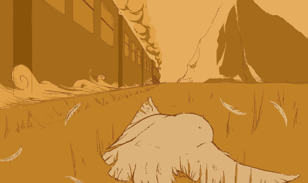
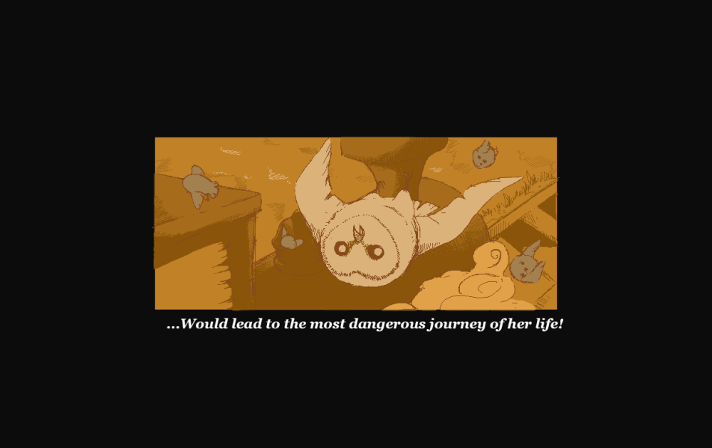
A reverse shot to show the shocked face of the owl mother and her children being scattered out a bit. Also liked the perspective of this one and it’s probaby the one picture with the least amount of continuity-mistakes of the whole bunch.
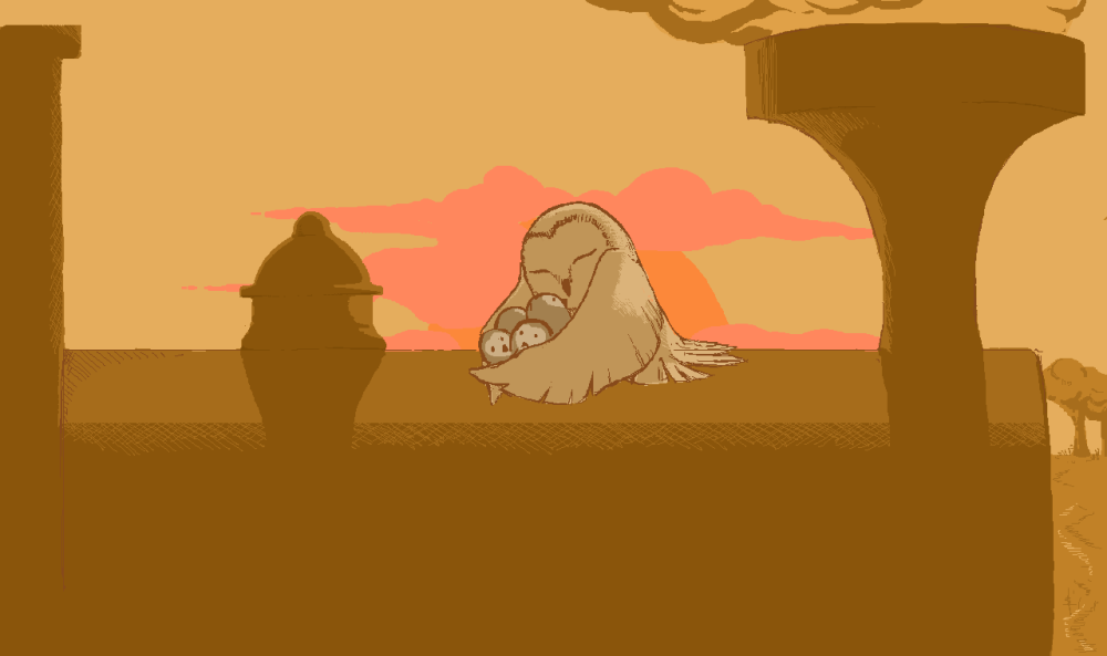
I’m being pretty negative here. I do not dislike these pictures, actually I’m pretty happy with them overall. I’m not very good at drawing different perspectives and enviroments, wich this task really challenged me with. The mistakes that I did had really nothing to do with that. They’re just sloppy blunders that I noticed too late.

I do hope that these things will not turn people off this little vignette as I put both time and effort into it and also had a really good time making it.

Blog week 5 – Winning and game over-screens

Hello there, dear blog-readers! We’re getting close to the end now with only one week left after this one. We have been using this time to finish and polish everything that we need for the end-product, both gameplay and graphics-wise. Since we haven’t really touched on our narrative in the game, I set out to draw some fitting pictures for both the opening-sequence and the win/fail-states of the game. This week I’ll show you some of the pictures that I’ve worked on the last week that will be used for this.

Let’s start with the sad game over-screen. This whole color-scheme was chosen because I wanted all the story-bits to have a special style to them, something that felt a little bit storybook-like in its presentation. I’ve also been working on an intro for the game using the same visual style, but I digress…

The kind of emotion I wanted to evoke with this is clear, it’s pretty sad. And while it dosen’t work as well without context, seeing the train speed away from you while you’re lying damaged on the ground after you fail… I thought was a pretty strong image.

Game over

While drawing this I started with a rough sketch of the owl as it was in comparison to her that I’d measure the scale of everything else in the picture. I used one-point-perspective to get the train right. Was thinking a while about how I could best simulate speed to the viewer and came to the conclusion that the best way to do it was to draw dust kicking up from beneath the wheels of the train. This also helped alot in making the train seem kind of like a raging beast. Everything else just came naturally after that, the mountain, the smoke etc.

So, now let’s go to a happy place, a timeline where everything was alright in the end!

The game ends when you reach the front of the train, the locomotive, with your owlets. So I thought that it would be sweet if at the end she’d get to share a peaceful hug with all of her children, showing that things are resolved. With this also came the idea of giving the last scene a bit of color, something soft and bright to fit the mood. A final sunrise.

Win!

Once again I started with the owl as she would be the center, the focus, of the picture. This one was easier than the other thanks to a much more simple perspective though. And even though I’m happy with it, I feel a little more accomplished when looking at the game over-screen, wich is pretty ironic, really.

I’m pretty happy with them, I think they each convey what they should, and the style was very fun to work with.

Blog week 4 – Branches

This week has been interesting… We’ve worked to make up for lost time and has as an result put in lots of things into the game on a short amount of time. My biggest problem starting this text was to choose wich one of the artefacts I should document, and while it’s not a big animation or anything this time, it has more to do with the process of its creation rather than how long it took to draw or animate.

And it all starts… with a branch.

The branch is one of the hazards of our game, one that is quite simple in the way that it works: If you don’t get out of the way when it’s coming towards you, you’ll get smacked. Now, yes, that sounds incredibly simple to make and maybe I made it harder than it had to be but either way there were some redesigns of it during the game-making process.

So… I didn’t start the work on it, there was another graphic artist on our that took on the work of making all of the hazards. He made a branch that worked, but I thought it looked a little flat. Unfortunately he was busy with making and animating our predatory bird-enemies, so I asked if it was ok that I picked up the artefact instead, wich he was ok with.


Branch

It was a task that looked deceptively simple, but alot of problems started popping up. As our game is purely from a profile-perspective, logically the branch should grow out of the trees towards the camera. Drawing it like that while still making sure that the branch is very visible, since it moves pretty fast across the screen, and that it looks like something that the player would want to avoid, was not easy. On the picture below you can see some of the stages that the branch went through.

The first one simply didn’t stand out enough for the player to see clearly and also know to avoid. By putting purple leaves on it, it became harder to miss, but also stood out like a sore thumb against the rest of the tree and still didn’t look dangerous enough.

Tree branch picture

Design 3 through 5 was an evolution of what I thought would be the final design, as it stood out more and also looked very threatening with its spikes.

As we playtested we noticed though that it still wasn’t enough. Some of the fault lied with the speed of the trees, wich will probably be tweaked, but as I started working on another design I thought: If the branch is too hard to see on the tree, what if… We just make an entirely new tree to go with it?

Terror tree

My thoughtprocess while working on this was now mostly one out of gameplay-perspective as it does stand out quite a bit from the other trees. But not only did I make a tree that gave you the signal of danger, but I also made the branch jut out much more than in the other designs. And by giving the rest of a tree a more silouetted look I wanted to make sure that the players eyes were drawn to the highlighted and pointy thing that are sticking out of it.

Unfortunately we haven’t playtested it yet, but I hope that it will finally be time to put this branch to rest.