Pre-production
The point of this series of blogs will be to explain and archive my workprocess, which means that it’s as much for myself as it is for you, the reader.
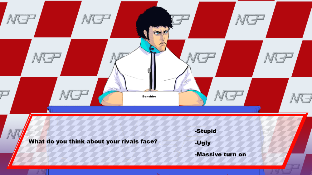
So to first describe the project in question: Fast Gear is a racing game which is heavily inspired by formula 1 and dating simulators. The main thing that seperates it from others within its genre is its focus on story and character-interaction between races. It’ll not stop there though, what we want to accomplish is that the two different segments of the game interconnects with eachother. For example, depending on what place you scored in your last race, interactions with the other characters will vary. If you crash into someone alot, they’ll call you out on it, etc.
It was early on decided that the racing should be in 3D, but that the interaction with the press and other characters will be handled with 2D-art and sprites.
My role on the project is that of art-lead and 2D-artist. That job includes trying to form the games aesthetics into a cohesive whole and also making most of the assets for the 2D-part of the game, though I will get help from the other artists when it comes to designing the cars and characters.

Early gameplay-concepts.
So the first and most important part was to decide on what kind of style we we’re going for. The first idea was a 80’s anime-artstyle. The main characters appearance especially was inspired by the aesthetic tropes of manga like Fist of the North star and the early days of Jojo’s bizarre adventure.

I made a in-game concept and while we liked the boxy aesthetic, it in some ways felt a little generic. So I tried different color-schemes and in the end arrived on this:

The idea for the color scheme came from miami vice, especially the strong turqoise of the road. We all liked this, so I made another concept.
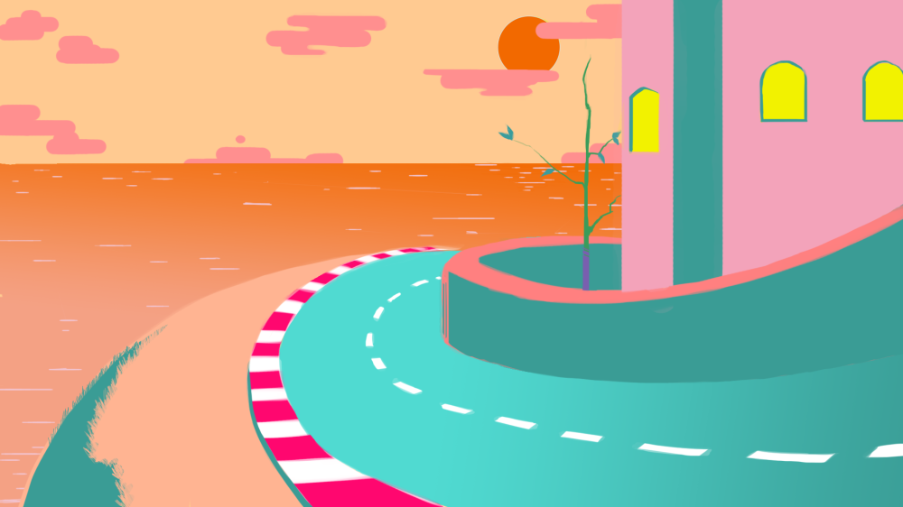
Our main colors were more or less decided at this moment, heavy use of turqoise and orange, with splashes of red and pink. The visuals are also very light on textures, but usually have gradients so as to make it pop more, making the colors feel more vibrant. Outlines shall be used sparsely.
And so we got a style.
The difficult part will be to balance the color-scheme so it dosen’t become too garish and tiring to look at. When creating characters and cars we also have to make sure they stand out next to the other present colors. We’re also not ure exactly how this will affect our character-design, but so far we still want to stick with the anime-inspired proportions.
But either way, this is just the beginning of the creation of…

Until next time!
Daniel Qvarnemark.
