Blog week 6 – Story pictures

Hello! Not much happened this week when it comes to graphics. Alot of time were spent on very small arifacts, writing in our design dokument or managing our backlog. Most of the in-game graphics were done but there was one last piece that we implemented this week: The story.

So this week we’ll take a look at the story-pictures that I drew for the intro of the game, wich sets up the event that you, the player, will take part in. I kind of went through how I thought with the aesthetic style of the story-pictures last week, but to sum it up quickly: I’m going for kind of a storybook aesthetic with a scale of brown and beige. Here I’ll go through what I thought with each of these pictures, what I like with them and also all the stupid mistakes I did with them…

Well, to begin with I should show you the first steps of their creation.

Sketch.jpg

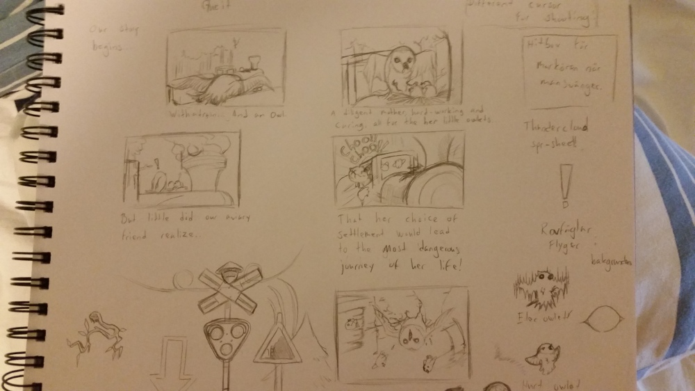
These are the first storyboards that I drew. Small and simple, and while my finished pictures are less messy and sketchy, these basics are still intact for most of them.

Story_image1

Ehm…

Story_image2

So here I wanted an establishing shot of the owl, the train and the enviroment around them. There are some sloppy mistakes though, like a missing window on the train, but overall this is one of my favorites.

Story_image3

This is the first point you get shown the owlets, whose rescue is the main objective with the game. Since the level-designer was still working on the level we didn’t know exactly how many owlets you’d be able to pick up during the game so the number changes a little between pictures… I also think this is the worst looking drawing of the owl in all of the pictures. Somethings just a little… Off…

Story_image4

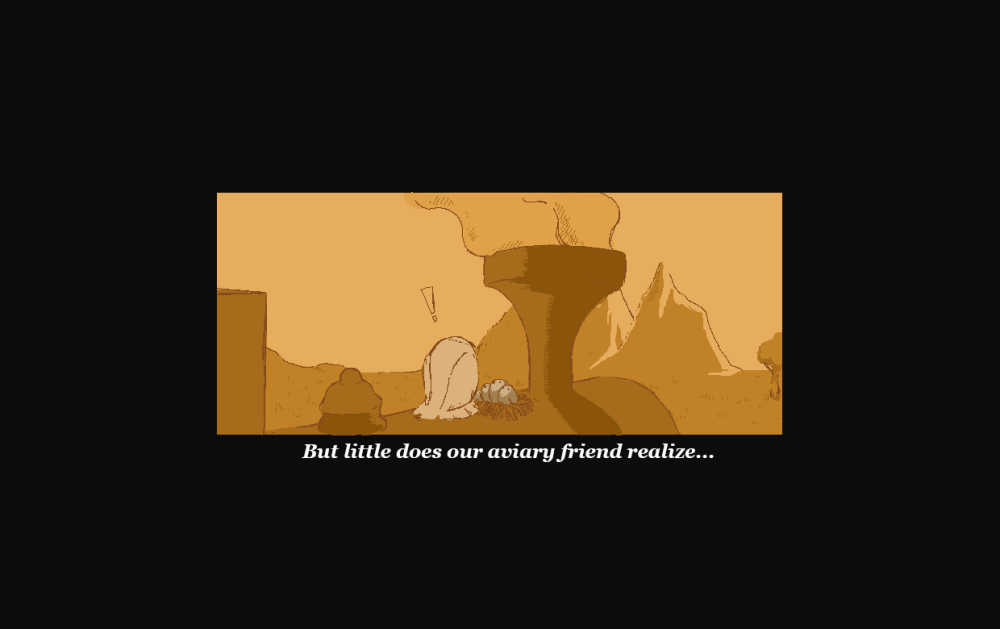
Smoke coming out of the chimney, the first sign that something is wrong for our little owl. The biggest mistake I made in this picture is a little more subtle this time. Apparently the sun decided to move to the other side of the earth and shine a little on that side instead.

Story_image5

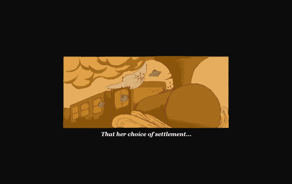
This is probably my favorite of all the pictures, the perspective and dynamics of the scene was pretty challenging to pull off, and the dust pushing out from the front of the train with smoke bulging from the locomotives chimney makes it clear that things are moving. Ofcourse there are some mistakes here too. One owlet is gone from the last picture and also that other thingimajig that should be on the engine of the locomotive.

Story_image6
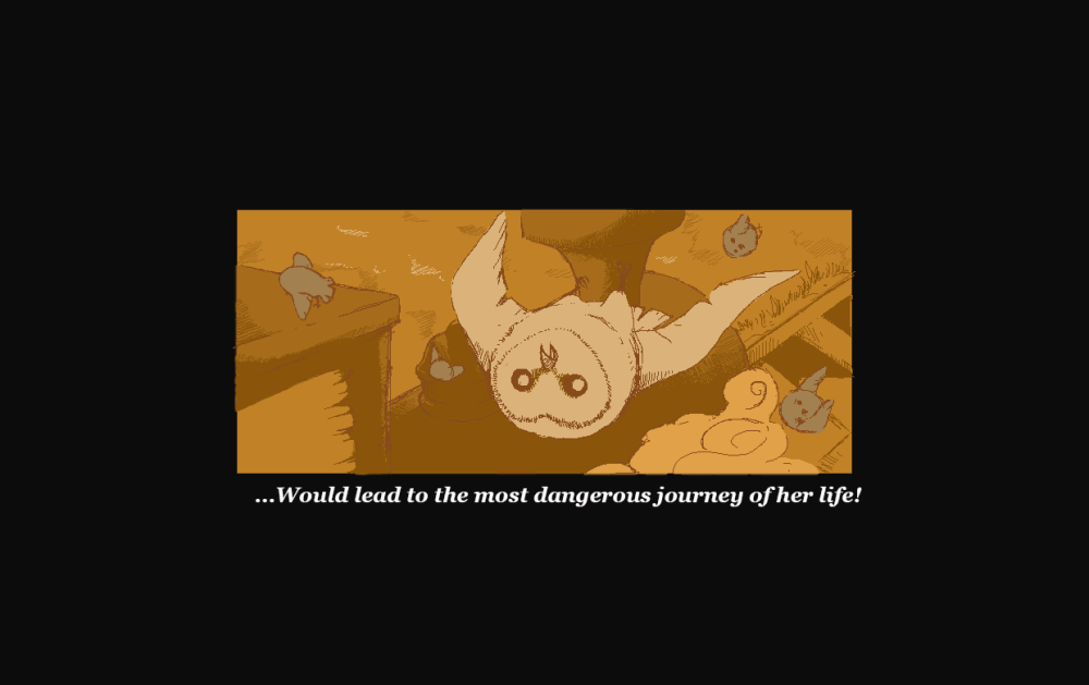
A reverse shot to show the shocked face of the owl mother and her children being scattered out a bit. Also liked the perspective of this one and it’s probaby the one picture with the least amount of continuity-mistakes of the whole bunch.

I’m being pretty negative here. I do not dislike these pictures, actually I’m pretty happy with them overall. I’m not very good at drawing different perspectives and enviroments, wich this task really challenged me with. The mistakes that I did had really nothing to do with that. They’re just sloppy blunders that I noticed too late.

I do hope that these things will not turn people off this little vignette as I put both time and effort into it and also had a really good time making it.

Blog week 4 – Branches

This week has been interesting… We’ve worked to make up for lost time and has as an result put in lots of things into the game on a short amount of time. My biggest problem starting this text was to choose wich one of the artefacts I should document, and while it’s not a big animation or anything this time, it has more to do with the process of its creation rather than how long it took to draw or animate.

And it all starts… with a branch.

The branch is one of the hazards of our game, one that is quite simple in the way that it works: If you don’t get out of the way when it’s coming towards you, you’ll get smacked. Now, yes, that sounds incredibly simple to make and maybe I made it harder than it had to be but either way there were some redesigns of it during the game-making process.

So… I didn’t start the work on it, there was another graphic artist on our that took on the work of making all of the hazards. He made a branch that worked, but I thought it looked a little flat. Unfortunately he was busy with making and animating our predatory bird-enemies, so I asked if it was ok that I picked up the artefact instead, wich he was ok with.


Branch

It was a task that looked deceptively simple, but alot of problems started popping up. As our game is purely from a profile-perspective, logically the branch should grow out of the trees towards the camera. Drawing it like that while still making sure that the branch is very visible, since it moves pretty fast across the screen, and that it looks like something that the player would want to avoid, was not easy. On the picture below you can see some of the stages that the branch went through.

The first one simply didn’t stand out enough for the player to see clearly and also know to avoid. By putting purple leaves on it, it became harder to miss, but also stood out like a sore thumb against the rest of the tree and still didn’t look dangerous enough.

Tree branch picture

Design 3 through 5 was an evolution of what I thought would be the final design, as it stood out more and also looked very threatening with its spikes.

As we playtested we noticed though that it still wasn’t enough. Some of the fault lied with the speed of the trees, wich will probably be tweaked, but as I started working on another design I thought: If the branch is too hard to see on the tree, what if… We just make an entirely new tree to go with it?

Terror tree

My thoughtprocess while working on this was now mostly one out of gameplay-perspective as it does stand out quite a bit from the other trees. But not only did I make a tree that gave you the signal of danger, but I also made the branch jut out much more than in the other designs. And by giving the rest of a tree a more silouetted look I wanted to make sure that the players eyes were drawn to the highlighted and pointy thing that are sticking out of it.

Unfortunately we haven’t playtested it yet, but I hope that it will finally be time to put this branch to rest.

Blog week 3 -Thundercloud and powerline animation

This week has been a week of ELECTRICAL ANIMATION!

I have two artefacts to show this time, both sharing the theme of a high voltage-count. For now I’ll start with the thundercloud wich has been the meatiest of all of the animation I’ve worked on so far.

The thundercloud is one of our hazards in the game. It’s a sinister cloud that moves across the top of the screen and shoots down a bolt of lightning at regular intervals that the player has to look out for.

Thundercloud_animation_unfinished

So this is the first animation I created. It’s alright, it’s functional, but I felt that there was something missing. A lack of force. A bolt of lightning is not just any old zap from a faulty power outlet. It’s a zigzaging beam of focused electrical energy that strikes down onto the earth from the heavens!

Simple to say, I wasn’t entirely satisfied with it.

So I thought about how I could give it that extra ”Omph!” that it needed, and I realised that the fault didn’t lie in the lightning itself, but in the cloud floating above.

Thundercloud_animation

There’s a basic rule in animation, that if you want to make a good looking, fluid and weighty motion you should use ”squash and stretch”. While animating the cloud I made use of squashing, as I not only pushed the cloud up a little, but also added particles wich torn off and pushed away from the cloud simulating a invisible force.                                           The trickiest part of this was to make the cloud fluidly return to its original state so the animation could loop. By cross-referencing the frames before and after each frame I drew  worked out in the end, although it’s a bit unrealistic how the cloud kind of bounces a bit like jelly.

The animation is made out of 16 frames, played up at a speed of 0,06 seconds between frames, with the sprite being about 160 pixels of height and 560 pixels of width.

There may still be some rough edges that I could smooth out, but overall I am quite satisfied with how it turned out. I feel like I got the power that I was looking for.

Electricity-animation

So this is the other electricity-themed artefact I worked on this week. It’s quite simple. A powerline that has to give away some kind of effect so that the player will know A. That it’s a powerline and B. That they probably shouldn’t cuddle with it. It’s exaggerated, pointy, fast and erratic as to look threatening to the player. It’s made out of 5 frames that are played at a speed of 0,05 seconds per frame.

It’s too bad that it got scrapped.                                                                                                            The way this hazard worked was very similiar to how another functioned, so we at the team found it unnecessary and redundant. Even though we probably should have reached this conclusion earlier I’m not heartbroken about it, that’s just what happens sometimes. And I still got experience doing it.

So this has been my week of high-voltage animation. Have a good day/evening, dear reader!

Blog week 1 – Damage animation

Elec-damage-animation

This is an animation for our game Trowl, a game that is about an owlmother who has built a nest on a train that one day starts rushing. With all of her children scattered around the train, she quickly has to start trying to find them. On the way, everything from predatory birds to dangers in her environment will try to make life harder for her.

Two of the obstacles she’ll have to face are thunderclouds on the top of the screen and electricity lines that hang above the train on the lower end of the screen. These will, upon contact, electrocute the poor owl and this is the animation that’ll play out whenever that happens.

Obviously I took alot of inspiration from cartoons when making this. Electrocution is a very horrible thing to bear witness to in real life but cartoons has always been good in making it a bit comical. While our game is alot about stress and pressure on the player in finding the owlets before the time runs out, we don’t want it to be a cruel or graphic game. I suppose I could have gone the whole route of making the sprite blink with it’s little owl-skeleton showing through, but I didn’t want it to be TOO goofy either. This is a good middleground I think.

The animation is pretty simple, there are three frames of animation that are going back and forth to create a fast and hard effect, drawing the body in a way wich makes it all distorted and pointy. I did hold back a bit the first time I tried it, but it just didn’t become fluid enough and looked really stale. I think I underestimated that even though the animation is supposed to be choppy in a certain way, the frames still has to go into one another to make it look good. So, I made it more excessive and tried to focus on leaving no area non-animated, creating movement on the whole sprite.

Death-animation

In the same category of work, I’ll call it ”damaged sprite”-work, I also created a death-animation. Also pretty simple, using four different sprites and spreading them out during 22 frames of animation. And It’s one that I’ll probably touch up a bit later, but the whole slow to fast falling-animation is one that’s essential to give the character some weight, usually used in fighting-games where the game slows down at the knockout and then speeds up as the body hits the floor. As with the electrocution-animation I didn’t want to make the death-animation overly cruel or graphic, more something that will make the player feel defeated. It’s harder to see in motion, but the last sprite in the animation looks so sad and beaten, and that’s the more or less the point of it.