Hello there, dear blog-readers! We’re getting close to the end now with only one week left after this one. We have been using this time to finish and polish everything that we need for the end-product, both gameplay and graphics-wise. Since we haven’t really touched on our narrative in the game, I set out to draw some fitting pictures for both the opening-sequence and the win/fail-states of the game. This week I’ll show you some of the pictures that I’ve worked on the last week that will be used for this.
Let’s start with the sad game over-screen. This whole color-scheme was chosen because I wanted all the story-bits to have a special style to them, something that felt a little bit storybook-like in its presentation. I’ve also been working on an intro for the game using the same visual style, but I digress…
The kind of emotion I wanted to evoke with this is clear, it’s pretty sad. And while it dosen’t work as well without context, seeing the train speed away from you while you’re lying damaged on the ground after you fail… I thought was a pretty strong image.
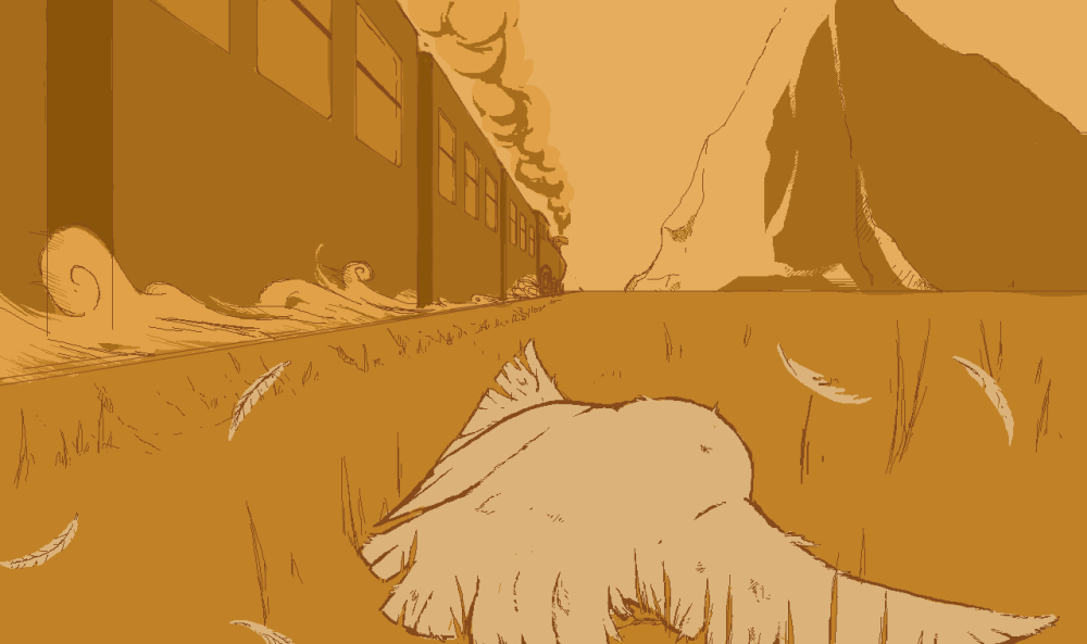
While drawing this I started with a rough sketch of the owl as it was in comparison to her that I’d measure the scale of everything else in the picture. I used one-point-perspective to get the train right. Was thinking a while about how I could best simulate speed to the viewer and came to the conclusion that the best way to do it was to draw dust kicking up from beneath the wheels of the train. This also helped alot in making the train seem kind of like a raging beast. Everything else just came naturally after that, the mountain, the smoke etc.
So, now let’s go to a happy place, a timeline where everything was alright in the end!
The game ends when you reach the front of the train, the locomotive, with your owlets. So I thought that it would be sweet if at the end she’d get to share a peaceful hug with all of her children, showing that things are resolved. With this also came the idea of giving the last scene a bit of color, something soft and bright to fit the mood. A final sunrise.
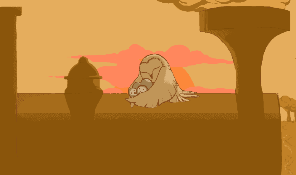
Once again I started with the owl as she would be the center, the focus, of the picture. This one was easier than the other thanks to a much more simple perspective though. And even though I’m happy with it, I feel a little more accomplished when looking at the game over-screen, wich is pretty ironic, really.
I’m pretty happy with them, I think they each convey what they should, and the style was very fun to work with.

Hi!
First off let’s see over the requirements for the weekly posts.
I’d say that it’s rather clear what exactly you have been working with during this week so there’s no problem there. Though you kind of skim past it, i’d say that the same goes for the why part of the post. A reoccurring trend with these blogs is to either not mention the why aspect of the production at all or just barely mention it. This is quite understandable since the target audience for these posts are fellow students working with the same kind of projects, When it comes to the how part of the post i’d say that you meet the requirements quite well. The order of progression with which you went about the creation of these images is understandable and it is very clear to me what kind of decisions you made during the production of this weeks assets.
One thing that crossed my mind is the fact that you are using the same, or at least very similar color schemes for both images. My opinion is that the message and feeling you are trying to sell to your audience would be much stronger if you actually had some more prominent differences in such things. You mentioned in your post that you wanted to have a consistent theme or style for both of the images and that i can understand. However i would say that decisions like coloring both images with the same kind of orange – brown scheme doesn’t really help in getting the message across to the viewer. That being said, i still think that both pieces are well made and despite minor details like what i mentioned they still do a good job to tell me the scenario and sell me the emotion of the scene.
All in all, good job on this weeks post!
– Måns
GillaGilla
Hello Daniel!
First of all, your post is really well written and easy to follow.
I really like the way they came out as they really reflect the theme of the game.
The end screen, when you die, is done in a very good way, especially the effect
that is given from the moving train – which you have succeeded to deliver in a really good way.
It’s also really nice that you go into detail about what you were thinking when designing it – even though it’s clear to the viewer.
I think the win-screen fits really great as well, especially when you added some new color to it. Very well executed!
Something that stuck me while looking at the last picture (win-screen) is that the colors could be further exaggerated to give that extra feeling of harmony.
Like I mentioned before, I think it’s very well written and the pictures are really amazing.
There’s no question that I as the observer read it as a win/ lose screen, without any explanation needed.
Something that I would like more of is how you visually made it from the sketch you mention, to the final result. This could perhaps been made by showing earlier stages of the picture, or putting them all together as a .gif.
I wish you and your group good luck for the final days before the hand-in and presentation on Friday!
/Lukas Group 10
GillaGilla